Built for πβLinkedInβBlueskyβThreads. Powered by AI
Write & schedule, effortlessly
Craft and publish engaging content in an app built for creators.
NEW
Publish anywhere
Publish on X, LinkedIn, Bluesky, Threads, & Mastodon at the same time.
Make it punchier π
Typefully
@typefully
We're launching a Command Bar today with great commands and features.
AI ideas and rewrites
Get suggestions, tweet ideas, and rewrites powered by AI.
Turn your tweets & threads into a social blog
Give your content new life with our beautiful, sharable pages. Make it go viral on other platforms too.
+14
Followers
Powerful analytics to grow faster
Easily track your engagement analytics to improve your content and grow faster.
Build in public
Share a recent learning with your followers.
Create engagement
Pose a thought-provoking question.
Never run out of ideas
Get prompts and ideas whenever you write - with examples of popular tweets.
@aaditsh
I think this thread hook could be improved.
@frankdilo
On it π₯
Share drafts & leave comments
Write with your teammates and get feedback with comments.
NEW
Easlo
@heyeaslo
Reply with "Notion" to get early access to my new template.
Jaga
@kandros5591
Notion π
DM Sent
Create giveaways with Auto-DMs
Send DMs automatically based on engagement with your tweets.
And much more:
Auto-Split Text in Posts
Thread Finisher
Tweet Numbering
Pin Drafts
Connect Multiple Accounts
Automatic Backups
Dark Mode
Keyboard Shortcuts
Creators loveΒ Typefully
180,000+ creators andΒ teams chose Typefully to curate their Twitter presence.
Marc KΓΆhlbrugge@marckohlbrugge
Tweeting more with @typefully these days.
π Distraction-free
βοΈ Write-only Twitter
𧡠Effortless threads
π Actionable metrics
I recommend giving it a shot.
Jurre Houtkamp@jurrehoutkamp
Typefully is fantastic and way too cheap for what you get.
Weβve tried many alternatives at @framer but nothing beats it. If youβre still tweeting from Twitter youβre wasting time.
DHH@dhh
This is my new go-to writing environment for Twitter threads.
They've built something wonderfully simple and distraction free with Typefully π
Santiago@svpino
For 24 months, I tried almost a dozen Twitter scheduling tools.
Then I found @typefully, and I've been using it for seven months straight.
When it comes down to the experience of scheduling and long-form content writing, Typefully is in a league of its own.
After trying literally all the major Twitter scheduling tools, I settled with @typefully.
Killer feature to me is the native image editor β unique and super useful π
Visual Theory@visualtheory_
Really impressed by the way @typefully has simplified my Twitter writing + scheduling/publishing experience.
Beautiful user experience.
0 friction.
Simplicity is the ultimate sophistication.
Queue your content inΒ seconds
Write, schedule and boost your tweets - withΒ noΒ need forΒ extra apps.
Schedule with one click
Queue your post with a single click - or pick a time manually.
Pick the perfect time
Time each post to perfection with Typefully's performance analytics.
Boost your content
Retweet and plug your posts for automated engagement.
Start creating a content queue.
Write once, publish everywhere
We natively support multiple platforms, so that you can expand your reach easily.
Check the analytics thatΒ matter
Build your audience with insights that makeΒ sense.
Writing prompts & personalized postΒ ideas
Break through writer's block with great ideas and suggestions.
Never run out of ideas
Enjoy daily prompts and ideas to inspire your writing.
Use AI for personalized suggestions
Get inspiration from ideas based on your own past tweets.
Flick through topics
Or skim through curated collections of trending tweets for each topic.
Write, edit, and track tweetsΒ together
Write and publish with your teammates andΒ friends.
Share your drafts
Brainstorm and bounce ideas with your teammates.
NEW
@aaditsh
I think this thread hook could be improved.
@frankdilo
On it π₯
Add comments
Get feedback from coworkers before you hit publish.
Read, Write, Publish
Read, WriteRead
Control user access
Decide who can view, edit, or publish your drafts.
Threads has quickly risen to the top tier of my design inspiration list...
I'm all in on this product > Slack
Here are my 10 favorite design details π
01 // Hover sidebar
When my device size is narrow, I can access the full sidebar on hover.
Slack makes me click and I always forget where the icon lives.
This flow is 10x more seamless and I almost prefer narrowing screens as a result...
02 // Playfullness
Threads doesn't take itself too seriously. Work can be fun too!
I love that they have these fun animated banners and allow me to add silly gifs as channel icons.
These are the kinds of details that make me want to spend more time in the product.
Speaking of keeping things lighthearted...
How great are these default avatars?!?
They even went the extra mile and allowed me to cmd + click to generate random background gradients π
This kind of personalization makes the product way more sticky π
03 // Customization
I'm a huge fan of products that allow me to control my own density settings.
This is something that can totally vary from channel to channel and I love that they give me the control.
(bonus points for these juicy borders)
04 // Opinionated
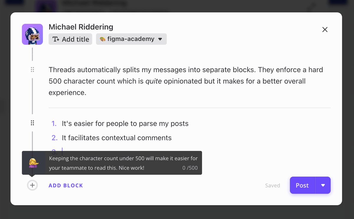
My favorite software products are often the most opinionated (and this is often what it takes to truly improve on existing workflows)...
Like how threads automatically creates new blocks after 500 characters.
I didn't know I needed this. But it's brilliant.
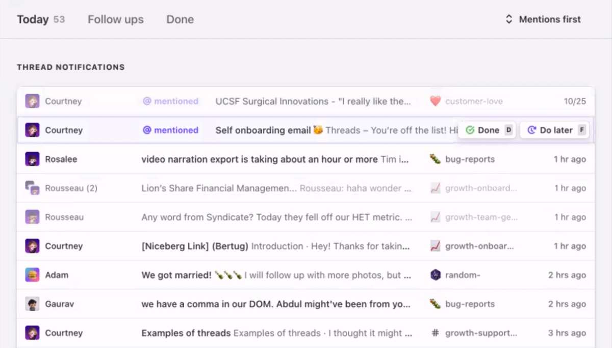
Another way that Threads is very opinionated is that things don't disappear until you mark them as "Done".
No more worrying about unread/read as a way to keep track of things.
I have a to do list!
It requires action on my part which is new, but I already love it β€οΈ
05 // Familiarity
Threads doesn't get cute or try to reinvent the wheel when it doesn't have to.
I LOVE huddles in Slack. And I'm glad that they simply brought the feature in as it already exists.
Innovate when necessary. Capitalize on familiarity when possible.
06 // Innovation
But they do pick the right places to innovate...
I am ALWAYS sharing Loom videos in Slack. But it creates a disjointed feedback experience.
So Threads went all in on video and it's so π much π better π
The vertical video makes it all feel more human too.
07 // Know your audience
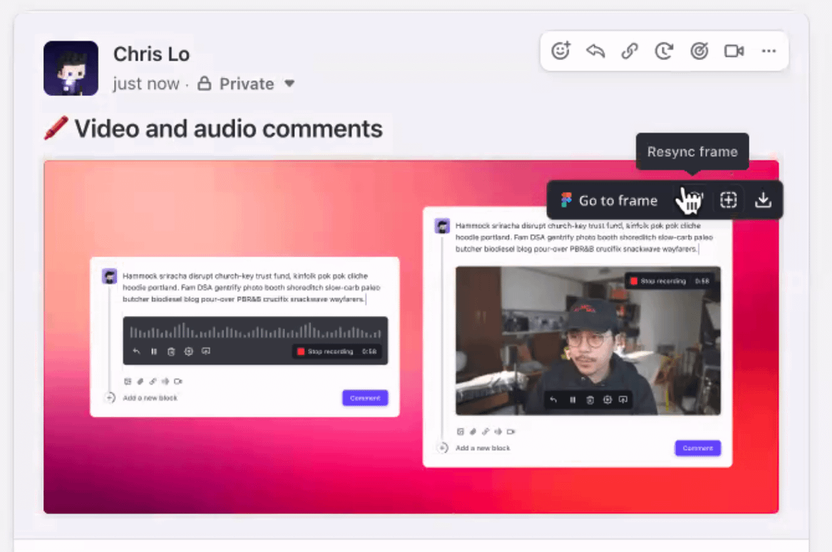
Threads went all in on designers by solving a core workflow challenge:
I'm constantly linking to Figma frames with accompanying screenshots
Except... those get out of sync QUICKLY.
Not anymore with "Resync frame" and a shiny new upload plugin πͺ
08 // Anticipation
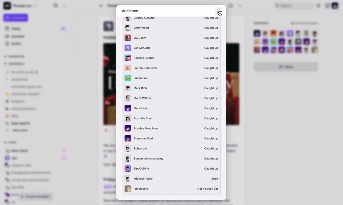
Threads anticipates the questions that I have...
Like "who has seen this already?"
I am CONSTANTLY asking that question in Slack but never considered it as a missing feature...
Being able to anticipate Qs like this demonstrates elite understanding π
09 // Keyboard shortcuts
My favorite products are all designed from the ground up to not require me to use my mouse.
Threads nails this and I love how keyboard commands are attached to hover states (this is one of my favorite details in Linear)
I also LOVE that they use simple letter key shortcuts but then turn them off whenever I'm focused in an input.
See how the "D" is removed from the done button on focus?
I super appreciate this attention to detail.
10 // Little big UI details
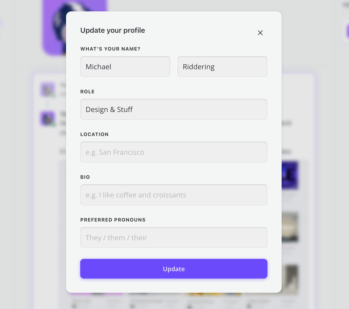
Threads cares about the tiny UI polish that makes a product truly beautiful
Just look at the detail on these inputs. The double borders... the subtle inner shadow... the shading...
It's all π€
And if you want to play with it yourself I highly recommend jumping on the waitlist:
(don't you just want to pop that icon in your mouth π€€)
threads.com
Lastly if you're looking for tips on organizing all of this inspiration...
I made a little tutorial video where I show you how to create the ultimate design swipefile in Notion π