Built for 𝕏∙LinkedIn∙Bluesky∙Threads. Powered by AI
Write & schedule, effortlessly
Craft and publish engaging content in an app built for creators.
NEW
Publish anywhere
Publish on X, LinkedIn, Bluesky, Threads, & Mastodon at the same time.
Make it punchier 👊
Typefully
@typefully
We're launching a Command Bar today with great commands and features.
AI ideas and rewrites
Get suggestions, tweet ideas, and rewrites powered by AI.
Turn your tweets & threads into a social blog
Give your content new life with our beautiful, sharable pages. Make it go viral on other platforms too.
+14
Followers
Powerful analytics to grow faster
Easily track your engagement analytics to improve your content and grow faster.
Build in public
Share a recent learning with your followers.
Create engagement
Pose a thought-provoking question.
Never run out of ideas
Get prompts and ideas whenever you write - with examples of popular tweets.
@aaditsh
I think this thread hook could be improved.
@frankdilo
On it 🔥
Share drafts & leave comments
Write with your teammates and get feedback with comments.
NEW
Easlo
@heyeaslo
Reply with "Notion" to get early access to my new template.
Jaga
@kandros5591
Notion 🙏
DM Sent
Create giveaways with Auto-DMs
Send DMs automatically based on engagement with your tweets.
And much more:
Auto-Split Text in Posts
Thread Finisher
Tweet Numbering
Pin Drafts
Connect Multiple Accounts
Automatic Backups
Dark Mode
Keyboard Shortcuts
Creators love Typefully
180,000+ creators and teams chose Typefully to curate their Twitter presence.
Marc Köhlbrugge@marckohlbrugge
Tweeting more with @typefully these days.
🙈 Distraction-free
✍️ Write-only Twitter
🧵 Effortless threads
📈 Actionable metrics
I recommend giving it a shot.
Jurre Houtkamp@jurrehoutkamp
Typefully is fantastic and way too cheap for what you get.
We’ve tried many alternatives at @framer but nothing beats it. If you’re still tweeting from Twitter you’re wasting time.
DHH@dhh
This is my new go-to writing environment for Twitter threads.
They've built something wonderfully simple and distraction free with Typefully 😍
Santiago@svpino
For 24 months, I tried almost a dozen Twitter scheduling tools.
Then I found @typefully, and I've been using it for seven months straight.
When it comes down to the experience of scheduling and long-form content writing, Typefully is in a league of its own.
Luca Rossi ꩜@lucaronin
After trying literally all the major Twitter scheduling tools, I settled with @typefully.
Killer feature to me is the native image editor — unique and super useful 🙏
Visual Theory@visualtheory_
Really impressed by the way @typefully has simplified my Twitter writing + scheduling/publishing experience.
Beautiful user experience.
0 friction.
Simplicity is the ultimate sophistication.
Queue your content in seconds
Write, schedule and boost your tweets - with no need for extra apps.
Schedule with one click
Queue your post with a single click - or pick a time manually.
Pick the perfect time
Time each post to perfection with Typefully's performance analytics.
Boost your content
Retweet and plug your posts for automated engagement.
Start creating a content queue.
Write once, publish everywhere
We natively support multiple platforms, so that you can expand your reach easily.
Check the analytics that matter
Build your audience with insights that make sense.
Writing prompts & personalized post ideas
Break through writer's block with great ideas and suggestions.
Never run out of ideas
Enjoy daily prompts and ideas to inspire your writing.
Use AI for personalized suggestions
Get inspiration from ideas based on your own past tweets.
Flick through topics
Or skim through curated collections of trending tweets for each topic.
Write, edit, and track tweets together
Write and publish with your teammates and friends.
Share your drafts
Brainstorm and bounce ideas with your teammates.
NEW
@aaditsh
I think this thread hook could be improved.
@frankdilo
On it 🔥
Add comments
Get feedback from coworkers before you hit publish.
Read, Write, Publish
Read, WriteRead
Control user access
Decide who can view, edit, or publish your drafts.
Ready to see how variables in @figma can level up your UI Kit?
Here's my system 👇
Quick outline:
First I'm going to show you the two current problems most UI Kits face
Then I'll walk you through a variables system that will make your life WAY easier.
Sound good? Let's dive in 👇
Problem #1:
UI Kit components should have a lot of shared attributes (padding values, border radius, height values, etc.).
When you don’t match these attributes across components you can end up with some pretty wonky scenarios… not great 😬
But this consistency is MANUAL 👇
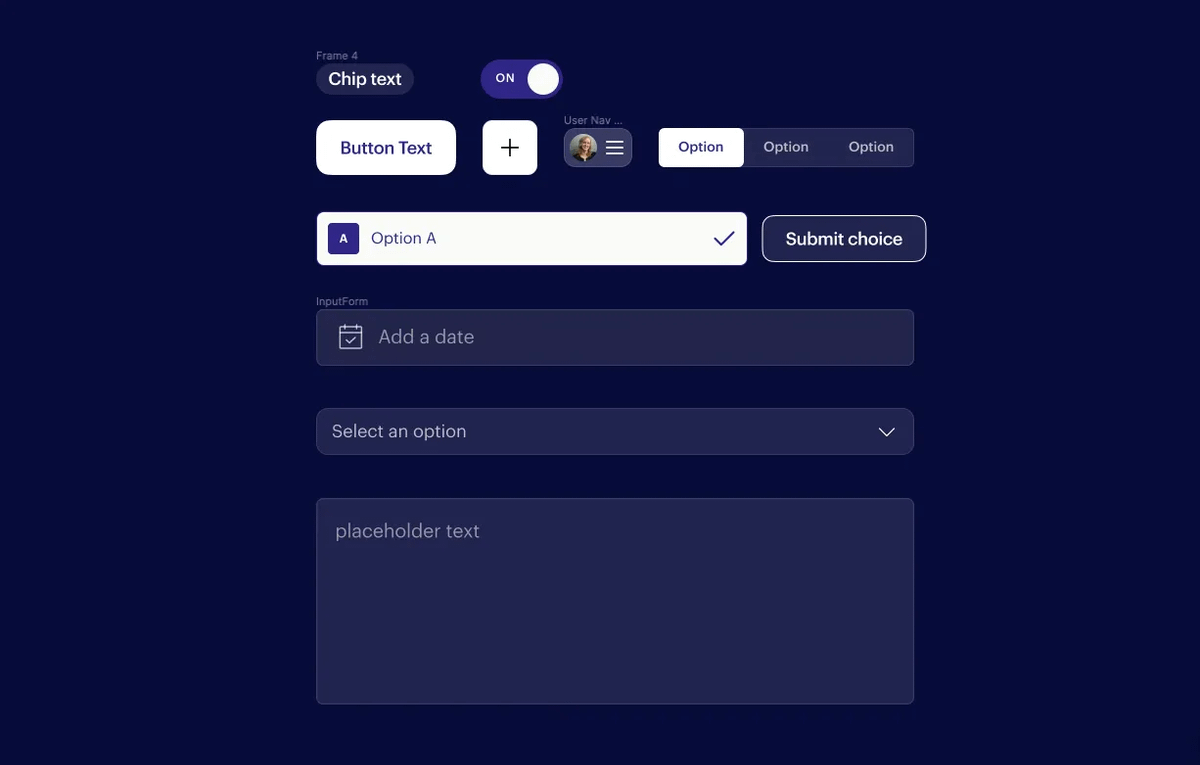
That means we have to remember that `small` size variants should all be 32px tall with 4px border-radius.
And each new component we add to our UI Kit also adds another knob that we have to turn to make future changes 🤦♂️
Problem #2:
Every component in our UI Kit required at least two breakpoint variants. Your `Button` component probably looked something like this (at the very least)👇
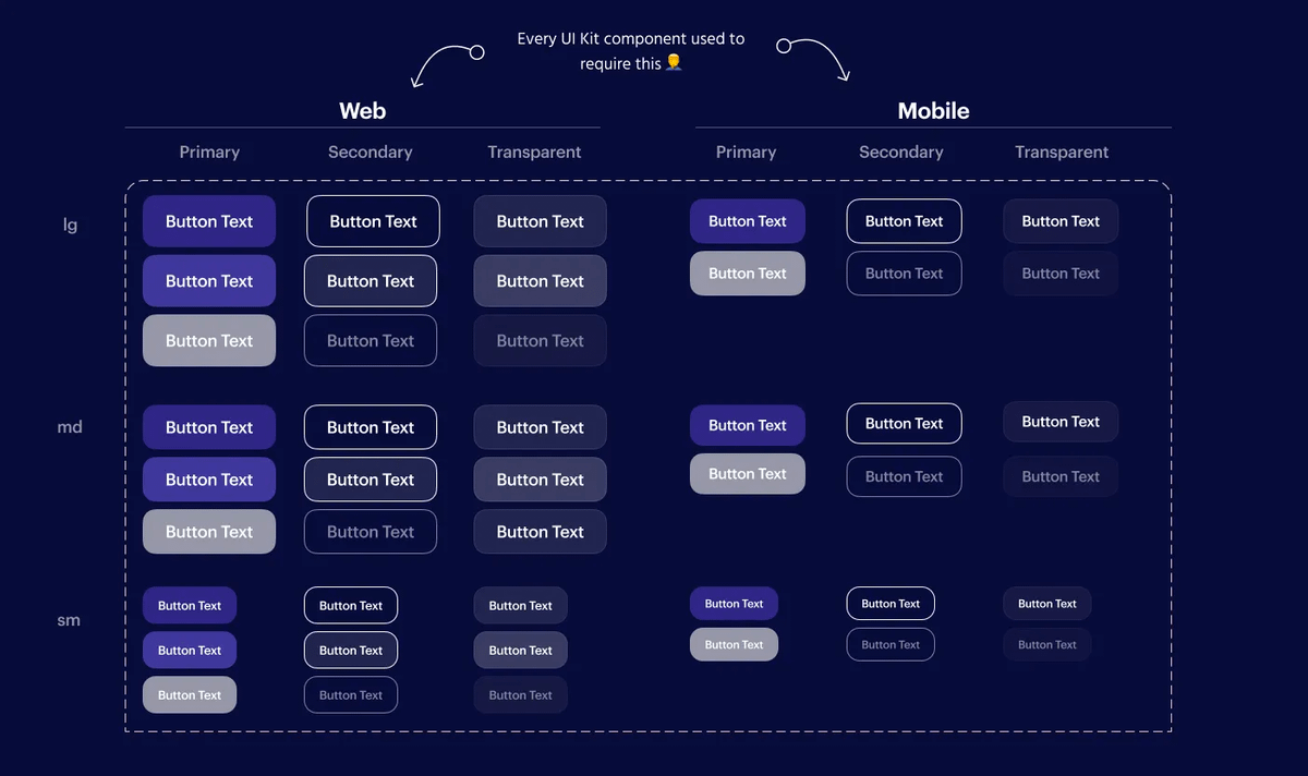
This also meant that we had to constantly change between these breakpoint variants in our files.
I don’t know about you… but it feels like I’ve done this workflow thousands of times in Figma 🙄
Don't worry... now there's a better way 👇
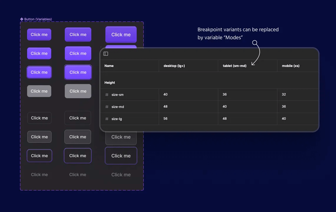
❌ Eliminating breakpoint variants
Now we can define our breakpoints as variable “Modes” within our UI Kit.
This means all of your component sets immediately get cut in half 🙌
📐 Ensuring consistency
But that’s just the beginning… variables also make it 10x easier to keep our UI Kit components consistent.
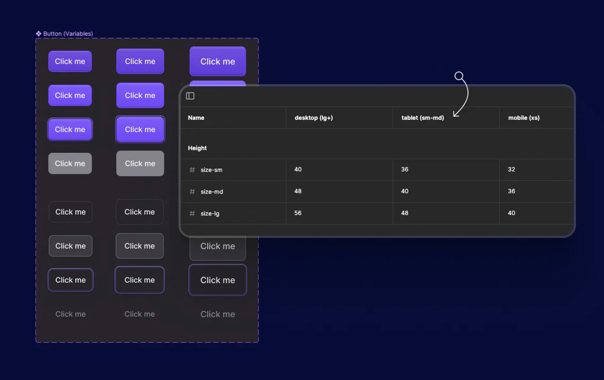
I typically have a single “size” variant that exists in basically every component in my UI Kit (ex: sm, md, lg).
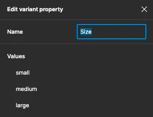
My goal is to be able to put a `md` input alongside a `md` button and have them share all of the core attributes (size, radius, etc.).
So this is how I’m currently thinking about my UI Kit variables 👇
• Modes = breakpoints
• Groups = component attribute (height, radius, padding, etc.)
• Variables = [attribute]—{size variant}
In natural language, I’m saying “On {breakpoint}, this is the {attribute} for components using the {size} variant“.
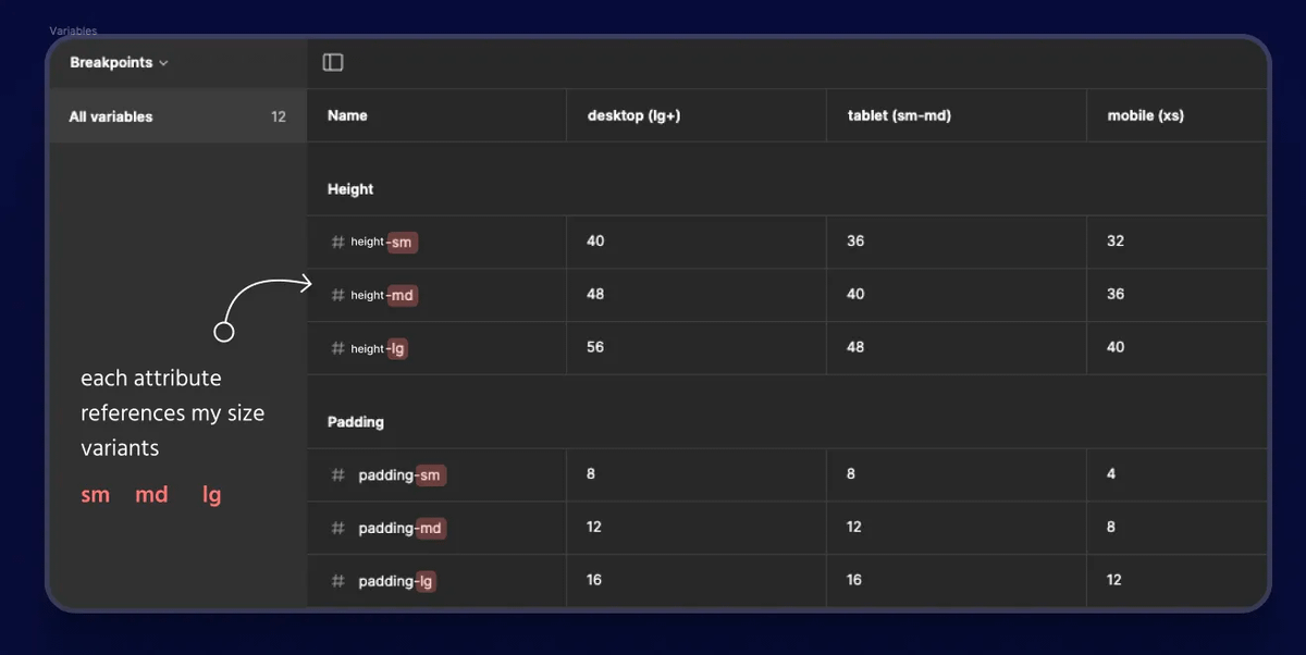
From there we can use these new variables when creating our UI Kit components 💯
If you’re creating a `lg` button then you simply select the “{attribute}-lg” variable for whatever part you are styling.
Here's why this is awesome 👇
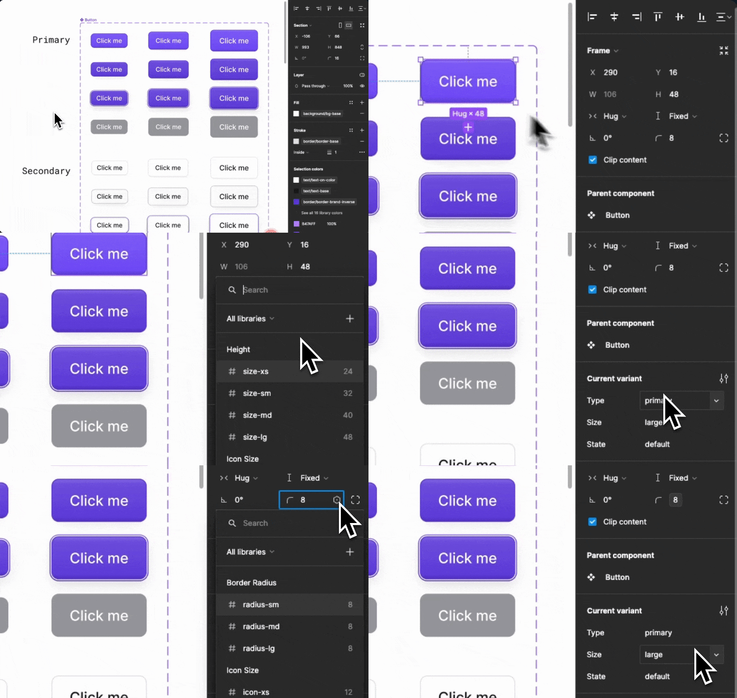
Every single time you put two `lg` components next to each other they will automatically match perfectly 😍
And if you ever need to make changes, now you have a single variable that you can use to control every component in your UI Kit 💪
🤖 Automating breakpoints
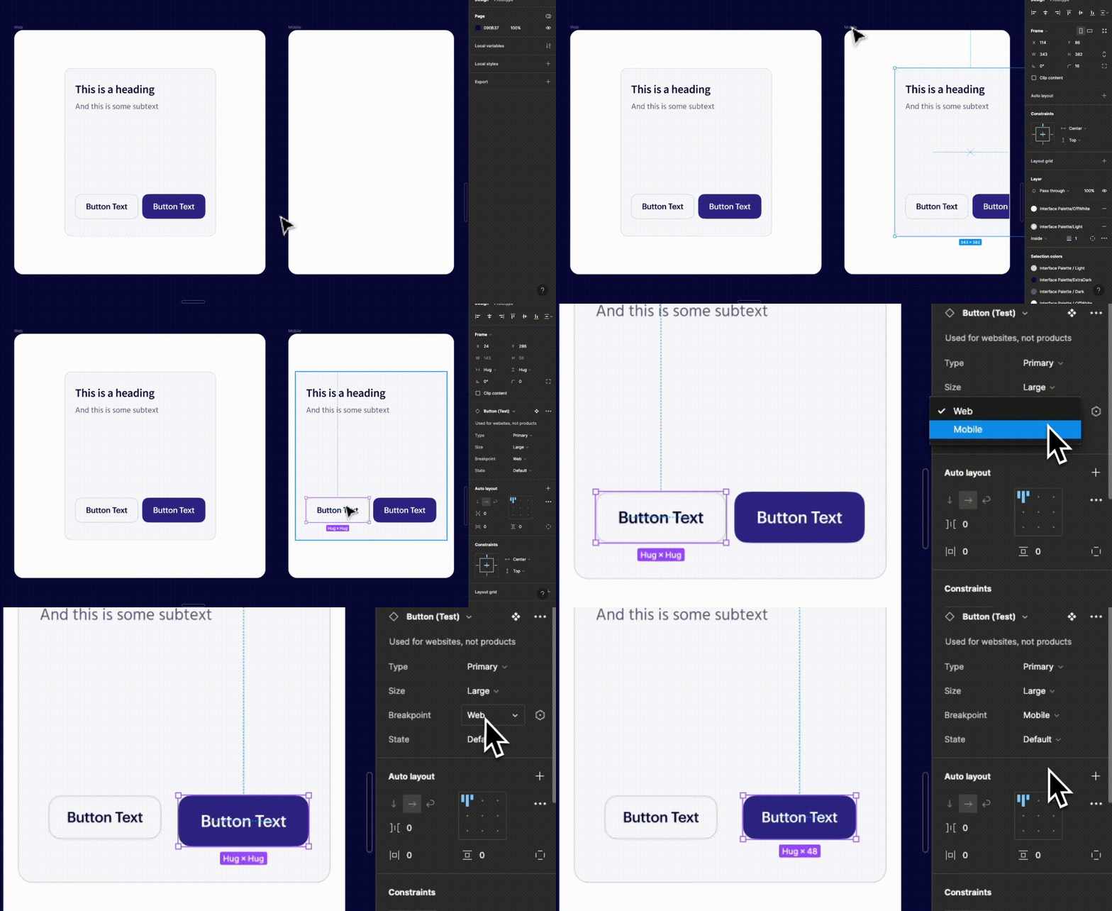
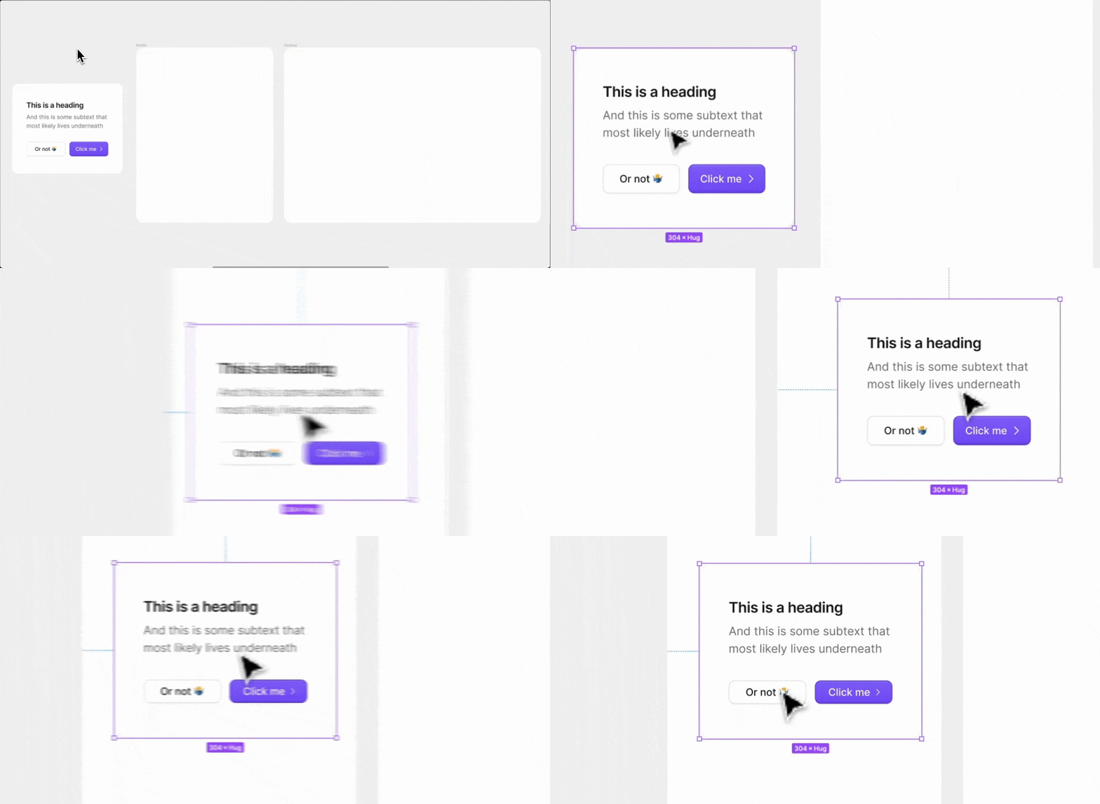
Since we’re importing our UI Kit in every file that we’re designing pages, we can also use these variable modes to assign breakpoints to our parent frames.
That solves one of the other core problems with the old way of building UI Kits 👇
Now all of our core components will automatically adjust to use the correct styles (no more manually switching between breakpoint variants).
Notice how the button sizes respond automatically in the .gif below 👇
Btw there's a whole lesson on this in figma.academy if you want to go deeper 🎨
You'll also get access to my UI Kit so you can see exactly how I set everything up 👇
I'll leave you with a general rule of thumb:
💡 Use variables to make your current workflows more streamlined, not to get your responsive designs to behave like the product itself.
Knowing when NOT to use variables is just as important as knowing what they are capable of ✌️