Built for πβLinkedInβBlueskyβThreads. Powered by AI
Write & schedule, effortlessly
Craft and publish engaging content in an app built for creators.
NEW
Publish anywhere
Publish on X, LinkedIn, Bluesky, Threads, & Mastodon at the same time.
Make it punchier π
Typefully
@typefully
We're launching a Command Bar today with great commands and features.
AI ideas and rewrites
Get suggestions, tweet ideas, and rewrites powered by AI.
Turn your tweets & threads into a social blog
Give your content new life with our beautiful, sharable pages. Make it go viral on other platforms too.
+14
Followers
Powerful analytics to grow faster
Easily track your engagement analytics to improve your content and grow faster.
Build in public
Share a recent learning with your followers.
Create engagement
Pose a thought-provoking question.
Never run out of ideas
Get prompts and ideas whenever you write - with examples of popular tweets.
@aaditsh
I think this thread hook could be improved.
@frankdilo
On it π₯
Share drafts & leave comments
Write with your teammates and get feedback with comments.
NEW
Easlo
@heyeaslo
Reply with "Notion" to get early access to my new template.
Jaga
@kandros5591
Notion π
DM Sent
Create giveaways with Auto-DMs
Send DMs automatically based on engagement with your tweets.
And much more:
Auto-Split Text in Posts
Thread Finisher
Tweet Numbering
Pin Drafts
Connect Multiple Accounts
Automatic Backups
Dark Mode
Keyboard Shortcuts
Creators loveΒ Typefully
180,000+ creators andΒ teams chose Typefully to curate their Twitter presence.
Marc KΓΆhlbrugge@marckohlbrugge
Tweeting more with @typefully these days.
π Distraction-free
βοΈ Write-only Twitter
𧡠Effortless threads
π Actionable metrics
I recommend giving it a shot.
Jurre Houtkamp@jurrehoutkamp
Typefully is fantastic and way too cheap for what you get.
Weβve tried many alternatives at @framer but nothing beats it. If youβre still tweeting from Twitter youβre wasting time.
DHH@dhh
This is my new go-to writing environment for Twitter threads.
They've built something wonderfully simple and distraction free with Typefully π
Santiago@svpino
For 24 months, I tried almost a dozen Twitter scheduling tools.
Then I found @typefully, and I've been using it for seven months straight.
When it comes down to the experience of scheduling and long-form content writing, Typefully is in a league of its own.
After trying literally all the major Twitter scheduling tools, I settled with @typefully.
Killer feature to me is the native image editor β unique and super useful π
Visual Theory@visualtheory_
Really impressed by the way @typefully has simplified my Twitter writing + scheduling/publishing experience.
Beautiful user experience.
0 friction.
Simplicity is the ultimate sophistication.
Queue your content inΒ seconds
Write, schedule and boost your tweets - withΒ noΒ need forΒ extra apps.
Schedule with one click
Queue your post with a single click - or pick a time manually.
Pick the perfect time
Time each post to perfection with Typefully's performance analytics.
Boost your content
Retweet and plug your posts for automated engagement.
Start creating a content queue.
Write once, publish everywhere
We natively support multiple platforms, so that you can expand your reach easily.
Check the analytics thatΒ matter
Build your audience with insights that makeΒ sense.
Writing prompts & personalized postΒ ideas
Break through writer's block with great ideas and suggestions.
Never run out of ideas
Enjoy daily prompts and ideas to inspire your writing.
Use AI for personalized suggestions
Get inspiration from ideas based on your own past tweets.
Flick through topics
Or skim through curated collections of trending tweets for each topic.
Write, edit, and track tweetsΒ together
Write and publish with your teammates andΒ friends.
Share your drafts
Brainstorm and bounce ideas with your teammates.
NEW
@aaditsh
I think this thread hook could be improved.
@frankdilo
On it π₯
Add comments
Get feedback from coworkers before you hit publish.
Read, Write, Publish
Read, WriteRead
Control user access
Decide who can view, edit, or publish your drafts.
Arc is a masterclass in product design π€―
It's so inspiring and I feel like we can all learn a TON from how it's designed.
So I've been taking all kinds of notes...
Here are the 9 design elements that stand out the most π
If you're not familiar, Arc is a new browser from @browsercompany
This isn't an incremental improvement on Safari/Chrome/etc.
It's a fundamental rethinking of what it means to surf the internet.
And @joshm has built a stellar team that is pushing the boundaries of design π
01 //
Arc doesn't bombard me with onboarding prompts all at once.
First they let me explore...
And then after I take an action they explain it, share additional context, and prompt the next action to take.
Plus these gradients are tasty π€€
02 //
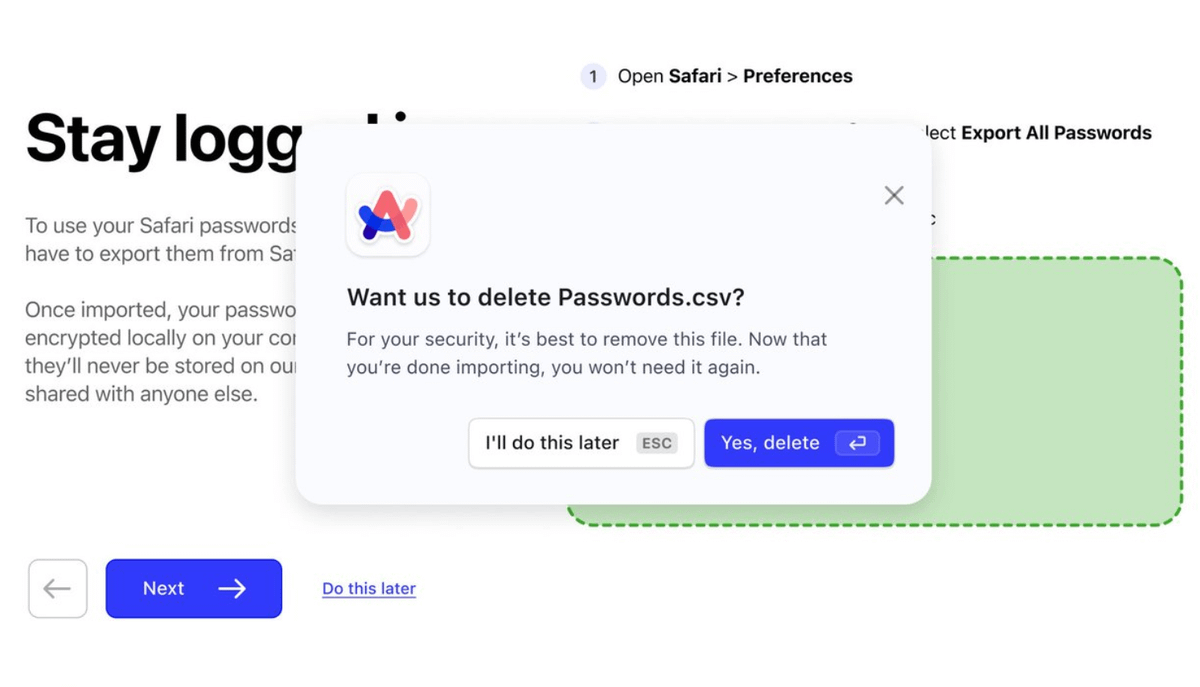
Arc doesn't limit the user journey to their own product surface area
For instance, after I upload my passwords, I'm immediately prompted to delete them from my downloads folder for security.
S/o to @kristinatastic for the designs on this one π
03 //
Arc allows me to make the space my own.
Personalization is such a great way to make a product sticky.
They didn't have to let me customize the amount of noise that I want to add to my gradients...
But it increases my attachment to the product big time π€
04 //
Arc prioritizes the little big details.
These library cards FEEL excellent.
Notice how smooth the hover is and how my mouse shines a light on the card itself?
Instead of focusing on "confetti moments"...
Arc makes the mundane delightful β€οΈ
05 //
Arc isn't afraid to be opinionated
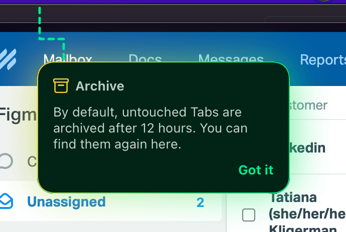
After 12 hours, they automatically close all of my tabs that I have not explicitly saved.
That seemed crazy at first...
But I LOVE it. Starting out my morning with a blank slate is incredible.
Sometimes designers know best π€·ββοΈ
06 //
Arc uses subtle animation to let me know what's happening.
As an example, look at how the URL bar animates on refresh.
It's such a small detail but it feels excellent π
07 //
Arc gets out of my way.
I love being given space to focus while removing all the clutter.
It's awesome for designers too b/c our browser basically look like a Figma prototype now π
(also peep those π₯ designs from @theyuanstudio )
Another example for 07...
I LOVE that the red/green/yellow menu circles are a simple dark opacity until I hover over them.
I know that they're there...
But the fact that they don't constantly pull my eyes up to the top left is a really nice touch π€
08 //
Arc understands the WHY behind my actions.
How many times a day do we click on email ONLY to see if there's anything new?
So they shrunk that journey down to a single hover state.
Maybe people will spend less time complaining about the blue gmail buttons now π
09 //
Arc has designed everything from the ground up with keyboard shortcuts in mind π§
You can always tell when shortcuts are added as an after thought because `cmd + k` menus are cool vs. when a team sets out to create a thoughtful, mouseless UX.
Arc nailed it.
I fully believe Arc will have a massive impact on the world of product design for years to come...
If you haven't already, make sure to get on the waitlist: arc.net/